Create charts with Python in a very similar way to creating charts using Chart.js

Overview


The power of Chart.js in Jupyter Notebooks

GitHub GitHub release (latest by date) Binder Awesome Chart.js

Installation

You can install ipychart from your terminal using pip or conda:

# using pip
$ pip install ipychart

# using conda
$ conda install -c conda-forge ipychart

Documentation

Usage

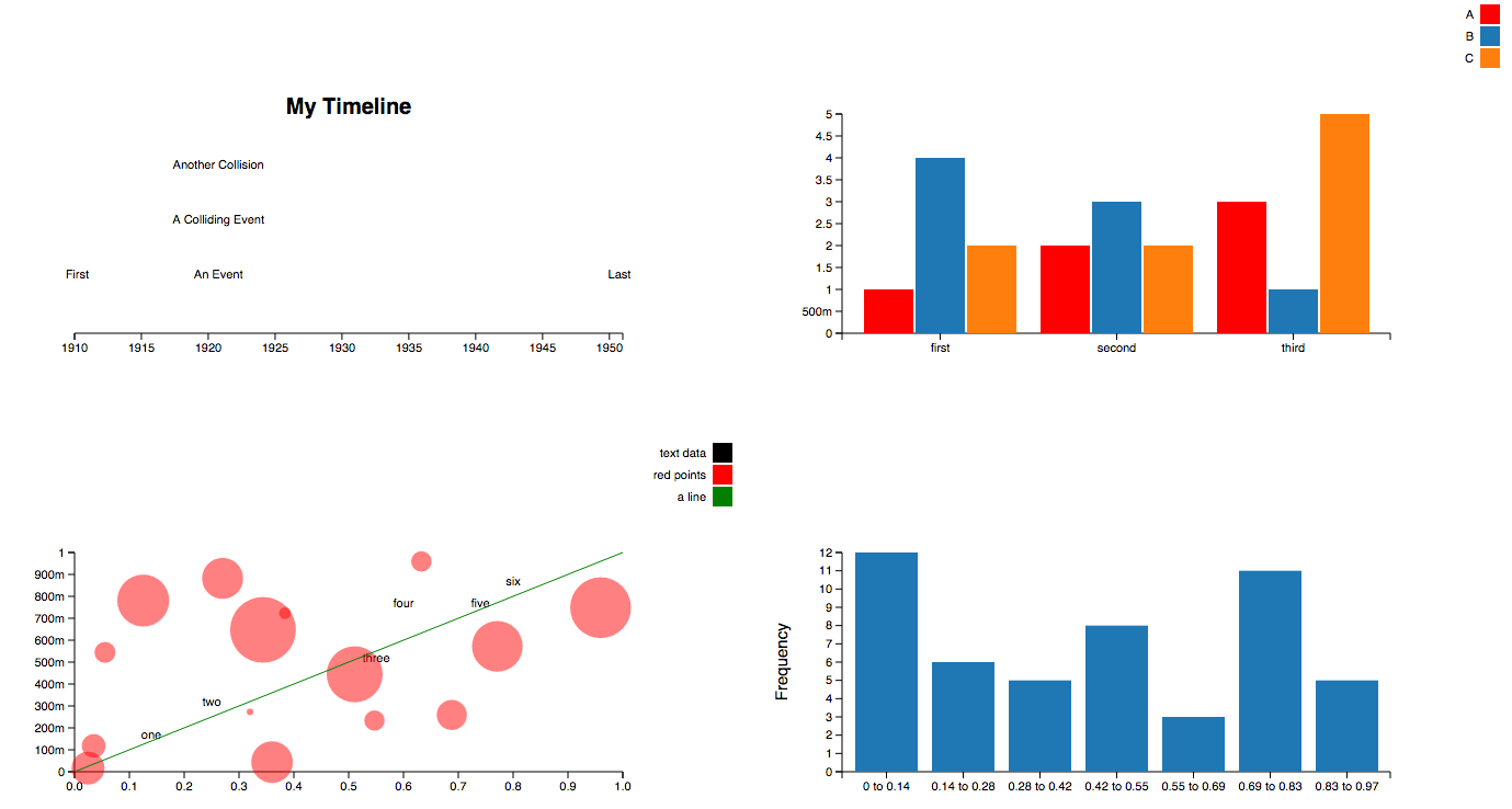
Create charts with Python in a very similar way to creating charts using Chart.js. The charts created are fully configurable, interactive and modular and are displayed directly in the output of the the cells of your jupyter notebook environment:

You can also create charts directly from a pandas dataframe. See the Pandas Interface section of the documentation for more details.

Development Installation

For a development installation:

$ git clone https://github.com/nicohlr/ipychart.git
$ cd ipychart
$ conda install jupyterlab nodejs -c conda-forge
$ cd ipychart/js
$ npm install yarn
$ npm install 
$ cd .. 
$ pip install -e .
$ jupyter nbextension install --py --symlink --sys-prefix ipychart
$ jupyter nbextension enable --py --sys-prefix ipychart

References

License

Ipychart is available under the MIT license.

You might also like...
Movies-chart - A CLI app gets the top 250 movies of all time from imdb.com and the top 100 movies from rottentomatoes.com

movies-chart This CLI app gets the top 250 movies of all time from imdb.com and

Simple plotting for Python. Python wrapper for D3xter - render charts in the browser with simple Python syntax.

PyDexter Simple plotting for Python. Python wrapper for D3xter - render charts in the browser with simple Python syntax. Setup $ pip install PyDexter

🧇 Make Waffle Charts in Python.

PyWaffle PyWaffle is an open source, MIT-licensed Python package for plotting waffle charts. It provides a Figure constructor class Waffle, which coul

🧇 Make Waffle Charts in Python.

PyWaffle PyWaffle is an open source, MIT-licensed Python package for plotting waffle charts. It provides a Figure constructor class Waffle, which coul

Drag’n’drop Pivot Tables and Charts for Jupyter/IPython Notebook, care of PivotTable.js

pivottablejs: the Python module Drag’n’drop Pivot Tables and Charts for Jupyter/IPython Notebook, care of PivotTable.js Installation pip install pivot

Drag’n’drop Pivot Tables and Charts for Jupyter/IPython Notebook, care of PivotTable.js

pivottablejs: the Python module Drag’n’drop Pivot Tables and Charts for Jupyter/IPython Notebook, care of PivotTable.js Installation pip install pivot

Streamlit dashboard examples - Twitter cashtags, StockTwits, WSB, Charts, SQL Pattern Scanner

streamlit-dashboards Streamlit dashboard examples - Twitter cashtags, StockTwits, WSB, Charts, SQL Pattern Scanner Tutorial Video https://ww

mysql relation charts

sqlcharts 自动生成数据库关联关系图 复制settings.py.example 重命名为settings.py 将数据库配置信息填入settings.DATABASE,目前支持mysql和postgresql 执行 python build.py -b,-b是读取数据库表结构,如果只更新匹

Altair extension for saving charts in a variety of formats.

Altair Saver This packge provides extensions to Altair for saving charts to a variety of output types. Supported output formats are: .json/.vl.json: V

Comments
  • Running the formatter with a function?

    Running the formatter with a function?

    Hey guys,

    Firstly, thank you for this! What a great implementation. I really appreciate your efforts.

    So I inherited a code base that I'm trying to streamline data while using JavaScript and Python. I'm running into an issue where I can't seem to get the formatter to work on data labels. I'll post the working JS version below and what I've tried to do in Jupyter/Python.

    setChartPercentages() { for (const set of this.chart.data.datasets) set.datalabels = { labels: { value: { formatter: function(value, ctx) { //ctx not needed, but including it as that's typically what the chart.js docs do. return value + '%' } } } } } This function is called when creating or updating charts. I simplified it a bit, but basically it shows total percent instead of the numbers.

    I tried to replicate this in ipychart. I've tried to use the callback function as stated in the documentation as well as just using the formatter. I even tried to combine them. All of them did not register the formatter.

    dataset = { 'labels': ['Data 1', 'Data 2', 'Data 3', 'Data 4', 'Data 5', 'Data 6', 'Data 7', 'Data 8'], 'datasets': [{'data': [14, 22, 36, 48, 60, 90, 28, 12], "datalabels": {"display": True, "labels": { "value": { 'formatter': { 'callback': '''function(value, ctx) {return '$' + value.toString()}''' } } } } }] }

    I also tried

    '''function(value, index, values) {return '$' + value}'''

    Any idea on how to get the formatter to register? Thank you a ton for any help.

    opened by timmyjl12 3
  • Animation with ipywidget

    Animation with ipywidget

    Thanks for this amazing library, I'm surprised it's not already super hyped as the plots are looking great, and at the moment there are zero good equivalents for Jupyter notebooks.

    It is stated in the doc that a plot could be animated with ipywidget. I tried, but there seems to be no equivalent to the Figure attribute of bqplot, or FigureWidget of plotly, which would be used in e.g. a widgets.VBox object. Here is what I currently have, which doesn't work:

    # Modules import
    from ipychart import Chart
    import ipywidgets as widgets
    import time
    import numpy as np
    
    # Define data and chart
    data = {'datasets': [{'data': [{'x': 0, 'y': 0}, {'x': 1, 'y': 1}]}]}
    mychart = Chart(data, 'line')
    
    # Define a button for animation
    btn = widgets.Button(description="Start", icon="play")
    
    # Callback to update the chart
    def update_chart(btn):
        for i in range(10):
            y = np.random.rand(2)
            with mychart.hold_sync():
                mychart.data = {'datasets': [{'data': [{'x': 0, 'y': y[0]}, {'x': 1, 'y': y[1]}]}]}
            time.sleep(0.1)
            
    btn.on_click(update_chart)
    
    # UI Combining Button & Chart
    widgets.VBox([btn, mychart])


    I believe I should provide something like mychart.fig instead of mychart to widgets.VBox, but I couldn't find any similar attribute in the Chart class. Any idea how to solve that? If yes, that would be a great addendum to the documentation. Thank you :)

    opened by ColasDroin 3
  • Running on jupyter-lab

    Running on jupyter-lab

    Hi,

    Nice project you've got here, just what I wanted.

    Could you add a warning in the "Installing" docs saying that this only works with jupyter-notebook and not with jupyter-labs?

    I don't know if it was a problem only for me, but I couldn't make it work on Jupyter-lab, I kept getting errors when the front-end tried to depend on jupyter.extensions.jupyterWidgetRegistry. Unfortunately I'm not that used with this whole notebook thing and lost a couple hours trying to make it work. 😅

    BR, Gabriel

    opened by Psidium 2
  • Chartjs graphs are not respecting the width and height of the container.

    Chartjs graphs are not respecting the width and height of the container.

    It seems ChartJS might be trying to maintain the aspect ratio in the Voila dashboard web app. I need to turn that option off by setting the "maintainAspectRatio: false" option. Could you add this to the IPYCharts package to correctly render the charts in Voila?

    opened by ndgayan 2
Releases(v0.4.0)
  • v0.4.0(Mar 17, 2022)

    New features in this version:

    • Chart.js backend was updated to 3.x.x. This is a major update, all changes can be seen here: https://www.chartjs.org/docs/latest/getting-started/v3-migration.html. This implies large performance improvements, easier customization, a rewritten animation system, bug fixes etc.
    • Doc: Move from GitLab pages to GitHub pages. Replace algolia search by flexsearch. Re-writing of some sections to match the new syntax of Chart.js 3.x.x. Better handling of components, which are now isolated in separates HTML files called by Vue scripts.
    • Convert all JS code to ES6 Javascript standard. Use ESLint and Prettier to clean the JS codebase.
    • Integration and adaptation of the colorscheme plugin into the codebase because original implementation is not compatible with Chart.js 3.x.x.
    • Start TDD on Python side.
    Source code(tar.gz)
    Source code(zip)
  • v0.3.3(Jan 21, 2022)

  • v0.3.2(Dec 18, 2021)

    New features in this version:

    • Pandas Interface : Complete refactoring of the API. Charts are now created using functions.
    • Added support of Jupyter Lab.
    • Added dynamic update of charts when an agument of the chart is modified. This bring a lots of possibilities to dynamically modify a chart, for example by using ipywidgets (sliders, buttons ...).
    Source code(tar.gz)
    Source code(zip)
  • v0.2.2(Nov 7, 2020)

    New features in this version:

    • Full cleaning of Python code
    • Reduce fontsize in tooltips (back to default size) for charts made using the Pandas Interface
    Source code(tar.gz)
    Source code(zip)
  • v0.2.1(Sep 15, 2020)

    New features in this version:

    • Add zoom feature (using https://github.com/chartjs/chartjs-plugin-zoom), allowing the user to zoom in the chart using his mouse. Double click on the chart will reset the zoom.

    Bug Fixes:

    • Fix tooltips for doughnut, pie, polarArea charts when using pandas interface (tooltips wasn't formatted in the same way as other charts).
    • Fix typing in methods of ChartDataFrame class in pandas interface.
    • Fix docstrings: removing excess arguments and adding missing arguments.
    • Various fixes and minor modifications in the documentation
    Source code(tar.gz)
    Source code(zip)
  • v0.1.4(Sep 4, 2020)

    New features in this version:

    • Pandas Interface : Tooltips are automatically generated to use the column names of the dataframe used to draw the chart. Therefore, the information displayed when hovering the Chart is more relevant and more complete!
    • Code optimization in both Chart & ChartDataFrame classes

    Bug Fixes:

    • Add missing requirements
    • Requirements & LICENSE are now packaged in the source distribution
    Source code(tar.gz)
    Source code(zip)
  • v0.1.3(Aug 2, 2020)

    New features in this version:

    • Pandas Interface : add aggregator in the y scale label for clarity purpose.

    Bug Fixes:

    • ChartDataFrame can now handle dataset_options as list (for 2 datasets when hue is activated) or as dict (for 1 dataset when hue is deactivated)
    Source code(tar.gz)
    Source code(zip)
  • v0.1.2(Jul 24, 2020)

    New features in this version:

    • Pandas Interface : draw charts from your pandas dataframe. More details in documentation.
    • Better handling of callback functions in Javascript side. Using loops & Lodash Javascript package instead of listing all possible callbacks.

    Bug Fixes:

    • Dalalabels automatic coloring didn't work when a colorscheme was selected.
    • Default point colors and border colors didn't work on mixed type charts.
    • Callback functions didn't work on axes options.
    Source code(tar.gz)
    Source code(zip)
  • v0.1.1(Jun 18, 2020)

    Second version of ipychart. Some new features are available:

    • Datalabels (using https://github.com/chartjs/chartjs-plugin-datalabels)
    • Colorschemes (using https://github.com/nagix/chartjs-plugin-colorschemes)
    • New default style
    • Export chart to html

    ... And several bug fixes.

    Source code(tar.gz)
    Source code(zip)
  • v0.1.0(Apr 29, 2020)

A simple python script using Numpy and Matplotlib library to plot a Mohr's Circle when given a two-dimensional state of stress.

Mohr's Circle Calculator This is a really small personal project done for Department of Civil Engineering, Delhi Technological University (formerly, D

Agyeya Mishra 0 Jul 17, 2021
Smoking Simulation is an app to simulate the spreading of smokers and non-smokers, their interactions and population during certain amount of time.

Smoking Simulation is an app to simulate the spreading of smokers and non-smokers, their interactions and population during certain

Bohdan Ruban 5 Nov 08, 2022
Data Analysis: Data Visualization of Airlines

Data Analysis: Data Visualization of Airlines Anderson Cruz | London-UK | Linkedin | Nowa Capital Project: Traffic Airlines Airline Reporting Carrier

Anderson Cruz 1 Feb 10, 2022
ScisorWiz: Differential Isoform Visualizer for Long-Read RNA Sequencing Data

ScisorWiz: Vizualizer for Differential Isoform Expression README ScisorWiz is a linux-based R-package for visualizing differential isoform expression

Alexander Stein 6 Oct 04, 2022
GUI for visualization and interactive editing of SMPL-family body models ie. SMPL, SMPL-X, MANO, FLAME.

Body Model Visualizer Introduction This is a simple Open3D-based GUI for SMPL-family body models. This GUI lets you play with the shape, expression, a

Muhammed Kocabas 207 Jan 01, 2023
Extensible, parallel implementations of t-SNE

openTSNE openTSNE is a modular Python implementation of t-Distributed Stochasitc Neighbor Embedding (t-SNE) [1], a popular dimensionality-reduction al

Pavlin Poličar 1.1k Jan 03, 2023
Piglet-shaders - PoC of custom shaders for Piglet

Piglet custom shader PoC This is a PoC for compiling Piglet fragment shaders usi

6 Mar 10, 2022
The Timescale NFT Starter Kit is a step-by-step guide to get up and running with collecting, storing, analyzing and visualizing NFT data from OpenSea, using PostgreSQL and TimescaleDB.

Timescale NFT Starter Kit The Timescale NFT Starter Kit is a step-by-step guide to get up and running with collecting, storing, analyzing and visualiz

Timescale 102 Dec 24, 2022
Histogramming for analysis powered by boost-histogram

Hist Hist is an analyst-friendly front-end for boost-histogram, designed for Python 3.7+ (3.6 users get version 2.4). See what's new. Installation You

Scikit-HEP Project 97 Dec 25, 2022
Info for The Great DataTas plot-a-thon

The Great DataTas plot-a-thon Datatas is organising a Data Visualisation competition: The Great DataTas plot-a-thon We will be using Tidy Tuesday data

2 Nov 21, 2021
This is a place where I'm playing around with pandas to analyze data in a csv/excel file.

pandas-csv-excel-analysis This is a place where I'm playing around with pandas to analyze data in a csv/excel file. 0-start A very simple cheat sheet

Chuqin 3 Oct 05, 2022
Pyan3 - Offline call graph generator for Python 3

Pyan takes one or more Python source files, performs a (rather superficial) static analysis, and constructs a directed graph of the objects in the combined source, and how they define or use each oth

Juha Jeronen 235 Jan 02, 2023
Gallery of applications built using bqplot and widget libraries like ipywidgets, ipydatagrid etc.

bqplot Gallery This is a gallery of bqplot examples. View the gallery at https://bqplot.github.io/bqplot-gallery. Contributing new examples Clone this

8 Aug 23, 2022
Plotly Dash Command Line Tools - Easily create and deploy Plotly Dash projects from templates

🛠️ dash-tools - Create and Deploy Plotly Dash Apps from Command Line | | | | | Create a templated multi-page Plotly Dash app with CLI in less than 7

Andrew Hossack 50 Dec 30, 2022
The windML framework provides an easy-to-use access to wind data sources within the Python world, building upon numpy, scipy, sklearn, and matplotlib. Renewable Wind Energy, Forecasting, Prediction

windml Build status : The importance of wind in smart grids with a large number of renewable energy resources is increasing. With the growing infrastr

Computational Intelligence Group 125 Dec 24, 2022
Python package to Create, Read, Write, Edit, and Visualize GSFLOW models

pygsflow pyGSFLOW is a python package to Create, Read, Write, Edit, and Visualize GSFLOW models API Documentation pyGSFLOW API documentation can be fo

pyGSFLOW 21 Dec 14, 2022
Plotting library for IPython/Jupyter notebooks

bqplot 2-D plotting library for Project Jupyter Introduction bqplot is a 2-D visualization system for Jupyter, based on the constructs of the Grammar

3.4k Dec 29, 2022
100 data puzzles for pandas, ranging from short and simple to super tricky (60% complete)

100 pandas puzzles Puzzles notebook Solutions notebook Inspired by 100 Numpy exerises, here are 100* short puzzles for testing your knowledge of panda

Alex Riley 1.9k Jan 08, 2023
The Metabolomics Integrator (MINT) is a post-processing tool for liquid chromatography-mass spectrometry (LCMS) based metabolomics.

MINT (Metabolomics Integrator) The Metabolomics Integrator (MINT) is a post-processing tool for liquid chromatography-mass spectrometry (LCMS) based m

Sören Wacker 0 May 04, 2022
Here I plotted data for the average test scores across schools and class sizes across school districts.

HW_02 Here I plotted data for the average test scores across schools and class sizes across school districts. Average Test Score by Race This graph re

7 Oct 27, 2021